Found
Curated Luxuries & Escapes.

Found is a publication specializing in high-end guides to modern metropolises. Found unveils dining delights, wanderlust escapes, exclusive interviews and indulgent recommendations. My expertise provided a firm design foundation for Found’s launch. This role entailed creating a library of newsletter components, developing a visual identity, and building social templates, positioning Found as must read city guide for the chic and elite.
My Role:
Competitive Research, Stakeholder Alignment, Wire framing, Design System, and Branding
Platforms:
Newsletter, Social, Web
Tools:
Figma, Canva, Substack, Beehiiv
Team:
Publication
“Working with Dair on branding and design was a highlight of the first days of FOUND. He brought all of his ample creativity, diligence, and good humor to the project — and he always overdelivered. We'd work with him again without hesitation.”
– Josh Albertson,
Co-founder, FOUND
Discover
Trends and Archetypes
Industry Frameworks
Compressed Formatting Reigns
Brevity rules in newsletters. Compressed formatting has become the norm, overshadowing long paragraphs. This trend reflects a shift towards more structured, reader-friendly formats in the newsletter industry. For further reading on an industry leaders approach check out Smart Brevity from the founders of Axios and Politico.
1. Formula Structure:
Consistent sections.

2. Varied Sections:
Select fitting sections.

3. Freeform :
Experts explore topics.

Define
Experience Essentials
Universal Schema
Newsletter Components
Through direct analysis of dozens of newsletters across editorial, lifestyle, and commerce verticals, I identified a repeatable structure used to engage readers and scale content operations. Despite variation in tone and format, most followed a consistent flow:
Intro: Utilities like date, edition, location, and weather. Clear branding through company name and title hierarchy. Most intros feature an editorial note or skimmable overview (e.g., TL;DR or spark notes).
Body: A mix modular snackable units: headlines, lists, product highlights, paragraphs and visual elements like pull quotes, charts, and cards. Partner content is typically separated with a clear label and CTA.
Outro: Closes with dense link clusters, recirculation blocks, or calls to action. Formats include “Most Popular” lists, sponsor shoutouts, and social or community invites.
This research surfaced a clear structure teams can use to design repeatable, high-performing newsletter systems across verticals, locations and use cases.

Develop
Style Sandbox
Font and Color
Patterns Set Stage
In the discovery phase, typography, color, and spacing from 20+ newsletters were analyzed, revealing immediate, clear patterns due to the medium's strictness. This data equipped Found with industry-wide newsletter formatting insights, setting the stage for strategic brand positioning.
Typographic Positioning

Color Breakdown
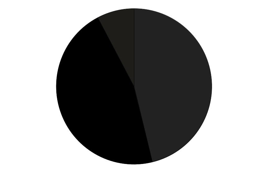
Header Type
Equal Blend of Black and Dark Gray.
#000000, #222222

Body Type
Mostly Dark Gray followed by Charcoal.
#222222, #333333

Backgrounds
Primarily White and Light Shades of Gray.
#ffffff, #f5f5f5-#f7f7f7
Utility Style Directions

Deliver
Visual Identity
Word Mark
The logo reinforces a clear, distinct brand voice. It features the Bourgeois typeface, created by Jonathan Barnbrook.

Logo Expansion
Locations are fitted with Helvetica, playfully nodding to the typeface's rich history in way-finding and luxury goods.

Design System & Color Palette
Guidelines were developed to support organic growth and seamless expansion. The system pairs utility-driven structure with a color palette inspired by pearl pastels and luxury tones—offering flexible options for editorial, identity, and marketing use.

Social Templates
The social extension showcases Helvetica's style range as a supporting font, with layout and typography amplifying the publication's editorial vision and art direction.

For more check out Found’s Newsletter or Follow them on Instagram
Home | Blog | Launch | Growth | Innovation
©2025 Dair Massey